Tooth and Claw is unique among my books in that I’ve liked all the covers it has had. (Even the Orb paperback is only boring, I don’t actually dislike it.)
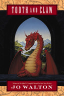 The original US cover also appeared on the Spanish and German editions. The red dragon is posed like Mona Lisa, and she has great hands. I think this cover does very well at conveying that it’s a book about dragons that are people without being humans. This was my first cover that I actually liked, and I’m still very fond of it.
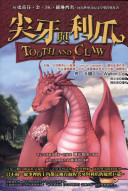
The next cover was the Chinese one — this was my first foreign sale, and I was very excited about it. I loved the cover, which was clearly drawn by somebody who knows what dragon ears are supposed to look like. This is an Asian person drawing a Western dragon, but using their own natural conventions about things like the ears. Also, it’s adorable.
The Czech cover is the best. Everything is the way I describe it, the bound wings, the little light, so it’s an accurate illustration and it’s also a terrific cover. This is not just my favourite cover for this book, it’s one of my favourite covers for any book of mine. I even tried unsuccessfully to buy a print. Look at that gorgeous little lamp, giving just the right amount of illumination for a dragon to read!
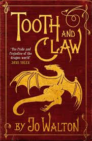 The UK cover is great, and it was the first time any publisher consulted with me about a cover. (A lot of firsts here!) They had various options for backgrounds, and asked me about it. I liked this one best, and they used it. This is a striking cover, and again I think it does very well at conveying something about the book. This is the cover used for the 2019 Tor adorable mini-hardback, and it looks even better at that size and shape, just really excellent. I also love the font here, the way the C wraps, and the lovely swirly J. I feel J is a letter that needs some dignity in the way of serifs.
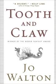
The Orb paperback reissue was trying to be subtle and elegant and minimalist like the Jonathan Strange and Mr Norell cover, tried a bit too hard and somehow crossed the line into being dull. Oh well. There’s nothing wrong with it, it’s a perfectly fine cover, with my name and a dragon, it’s just somehow not very interesting. Not the kind of cover that would make me pick it up — which all the others are, pretty much! This came out about the same time as the UK one above, and I couldn’t help making comparisons. It stayed in print for some time and lots of people bought it — as I said, it’s not a terrible cover, just unexciting compared to all this wealth of wonderful covers the book has been lucky enough to have had in other editions. It doesn’t convey the element of fun in the book. The other covers manage to hit the point of “combining gruesome and charming”, which is what the book is doing, this one just says “a dragon”.
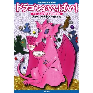
The Japanese paperback — it’s so Japanese and so great! The title translates as “Full of Dragons”. There was a sober Japanese hardcover with the US cover, I signed it for somebody at a con once, but this paperback is unconditionally fun and I love it. Look at the teacup and saucer! And the extreme pink of the dragon! (I think it’s Sebeth.) And the other dragons in the background. And the title — I mean, it is full of dragons, the whole book is full of dragons. And again, the ears. Asian illustrators know what dragon ears are like, they don’t have to stop to think about it, even when the dragon is bubblegum pink and drinking a cup of tea. Lovely.
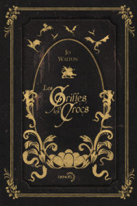 There are two French covers, the big paperback cover and the pocketbook cover. The big paperback looks like a French nineteenth century novel, and it isn’t until you look closely at it you see that those are eggs and dragons, not flowers! The pocket book cover is less subtle but also fun you’d definitely know that this is a book about Victorian dragons — I think both of these are great.

